 Algolia
Toast Messages
Introduction
It is a small message that shows up in a box at the corner of the screen and disappears on its own after a few seconds. It is simple feedback about an operation in which current activity remains visible and interactive.
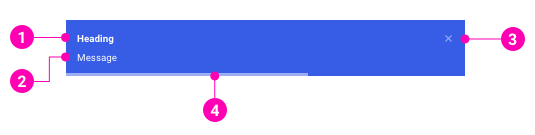
- Heading- A title to explain what the message content is about.
- Message - The information that the system wants to send to users. Message content can include paragraphs and links.
- Close button - Optional to close the message immediately.
- Progress bar - The display time remaining of the message before it disappears.
Examples
Design Reference
N/A
API
ToastContainer
ToastContainer
import { ToastContainer } from '@gotitinc/design-system'Copy import code for the ToastContainer component| Name | Type | Default | Description |
|---|---|---|---|
| position | 'top-left' | 'top-right' | 'top-center' | 'bottom-left' | 'bottom-right' | 'bottom-center' | 'top-right' | One of top-right, top-center, top-left, bottom-right, bottom-center, bottom-left |
| autoDismiss | boolean | number | 5000 | Delay in ms to close the toast. If set to false, the notification needs to be closed manually |
| dismissible | boolean | true | Renders a properly aligned dismiss button |
| hideProgressBar | boolean | false | Display or not the progress bar below the toast(remaining time) |
Powered by Got It, Inc.